What does an operations director look at first?
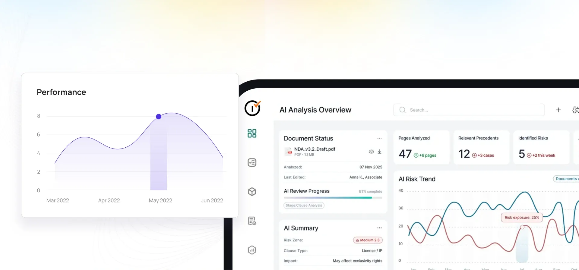
Usually the portfolio position, then whatever looks wrong. A configurable dashboard puts compliance status, open issues, and team performance across every site on one screen, and the drill-down goes from a portfolio KPI to an individual inspection in a few clicks. That path matters more than the headline number. A director who can see that compliance dropped, then immediately see which region, which site, and which inspection caused it, can act the same morning. Without it the sequence is a number, an email, a phone call, and a day lost before anyone knows what happened. Because dashboards are configurable by role, the site manager view and the executive view can differ without maintaining two reporting systems.
How do we send every client their own report without building it?
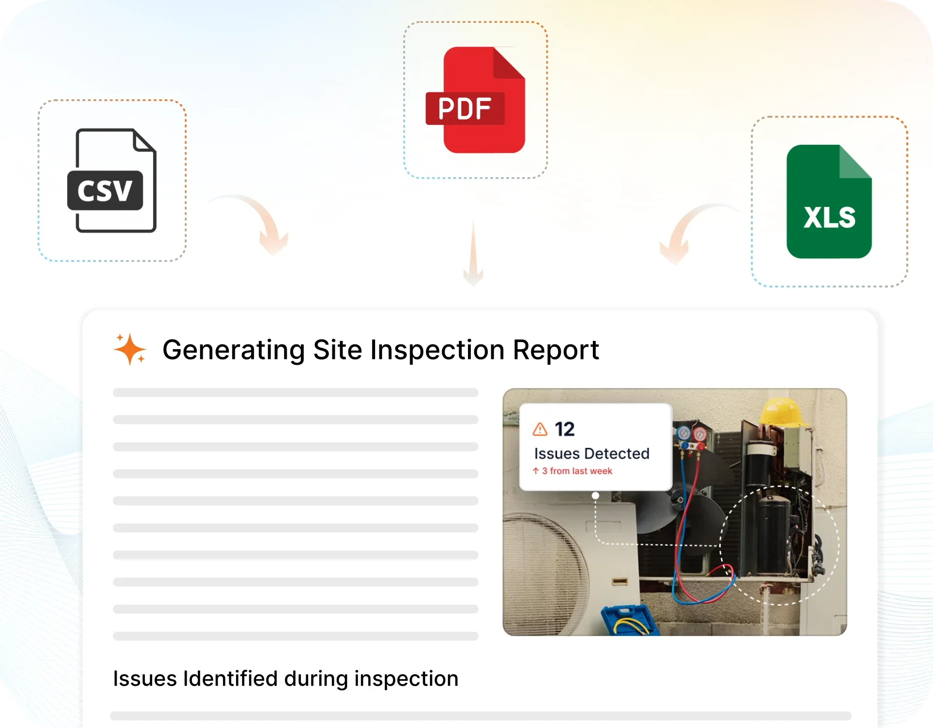
Reports are generated from the inspection data and delivered on a schedule, branded, with the photos, scores, and open corrective actions already in them. For a facilities management company running many client properties this is often the single largest administrative saving, because client reporting is otherwise a recurring manual task that consumes the end of every month and produces documents that are out of date by the time they arrive. Automating the assembly and the delivery removes both problems at once. It also standardises what each client receives, which reduces the slow drift where different account managers report different things in different formats.
What does a heatmap show that a report does not?
Concentration. A report tells you what failed; a heatmap tells you where failure clusters across sites, zones, and equipment. Those are different questions and the second one is usually the actionable one. A list of two hundred issues invites you to work through them in order, which is how teams end up treating symptoms indefinitely. Seeing that a third of them sit in one zone, or on one class of asset, changes what you do next. It is also the fastest way to find the problems nobody reported as a pattern, because each individual instance was handled by a different person on a different day and looked unremarkable to all of them.
Can it warn us before a site fails an audit?
That is what compliance risk scoring is for. Rather than reporting only what has already happened, the platform scores sites and assets on their likelihood of future failure, drawing on inspection history and issue patterns. The value is in the timing. A compliance problem found by an auditor is expensive and public; the same problem found three weeks earlier is routine maintenance. Risk scoring is a prioritisation tool rather than a prediction to be trusted blindly, so the sensible use is to direct attention, not to replace judgement. Teams typically use it to decide where the next round of inspections should focus when they cannot cover everything at once.
Why not just export everything to a spreadsheet?
Plenty of teams do, and it works until it does not. A spreadsheet is a snapshot: accurate the moment it was exported and progressively less so afterwards, which is why so much reporting describes a situation that has already changed. It also requires a person, and that person is usually a manager spending a Friday afternoon assembling numbers instead of running operations. The deeper problem is that each export is disconnected from the last, so trends have to be rebuilt by hand and rarely are. Live dashboards remove the assembly step entirely, and because the history is continuous rather than a folder of files, patterns across months are visible without anyone reconstructing them.